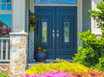
This is an interior decorating project you can do.
Your color palette is what makes the rooms in your home come together.
Well designed homes always have a beautiful color palette that flows between rooms from the entrance to the living room, family room, kitchen, powder room, stairway, etc.
This flow is the relationship created from one room to another.
A color palette is not the same as a paint color.
The palette incorporates various paint and room colors.
Not every room needs to be the same color or shade thereof though they do need to relate to one another.
Good interior design begins with a well thought out color palette.
Start with the colors you already like.
What do you gravitate to? What colors are in your closet? What colors are in your garden? Think about how certain colors make you feel this will send you in the right direction.
Be confident and don't apologize.
Your room and home colors should reflect you and your personality, not your neighborhood design trend.
Maybe there is a particular color or combination of colors you like.
Look at a paint deck or around your house and note all the different colors of these favorites that appeal to you.
Now you have a starting point to which you can add other colors.
Study your environment.
Do you live in the woods with windows that look on to the many different shades of green leaves or a fifth floor condo with the view of the urban building landscape? Determine how important your view is and if you want to make it part of your interior space.
This can give you a clue to selecting colors.
If the view is important to you consider your window as blocks of existing color you need to coordinate with.
Consider adjoining rooms or areas you can see from the room you are working on.
In most cases, you need to make a visually coordinated connection with any adjoining space.
Pull aside any existing furniture items, artwork, area rugs that you are not changing as these may give you a color clues for a particular room.
Artwork and area rugs are great places to create a color palate from because it is already there.
Tools to create your color palette: o Determine what colors you like o Colors from environment o Adjoining rooms o Existing furnishings Your interior color palette is the coordination of the colors you like.
How you coordinate the colors is important.
The following example is how a favorite color of combination is royal blue and light grass green work in a home.
The rooms on each side of the living room are open to or visible from it.
Guests would enter the great room first and then go left or right to the other rooms.
In this example the public rooms on the main floor are (from left to right) a kitchen, dining room, great room, and TV room.
As we start in the kitchen all of the cabinets are royal blue with a neutral countertop.
There is a multi-color tile backsplash above the stove (lime green, lavender, orange, yellow, pink, blue/green and royal blue).
The kitchen which is open to the dining room share the same white walls (in different materials) and ceiling.
The same neutral light bamboo floor flows from these areas flows into the great room.
The blue glass light fixture in the dining room is the only dominant fixed color.
With white walls and ceiling, light green is the dominant color in the great room furniture with major accents of royal blue followed by other colors (pink, orange, lavender and shades of blues and greens).
On the right, the TV room is primarily a neutral color (same on walls, ceiling, floor and furniture) with the next largest color being a vivid pink with small amounts of lime green.
These colors appear on back cushions and pillows on the sofa, one chair and in the artwork.
From this example you can understand how colors flow and relate from one room to another.
The colors aren't the same in each room but they come from one palette: royal blue and light grass green.
Green is the one color in different shades and intensities which appears in each room.
Though it doesn't appear in fixed form in the dining room it appears in various table linens, dinnerware and accessories.
Our homes are about relationships, the relationships of the inhabitants, the room functions and the visual relationships that create warmth and comfort to all those who enter.
The décor in each room in your home should tell its' own individual story, however the color palette is what creates flow and harmony.
To create a "home" all of the individual stories become related by color and sometimes a theme.
SHARE


